Preventing Background Click of Link-Wrapped Images with :has()
Oftentimes websites provide an option to enlarge images in a popup overlay with a JavaScript-based solution like lightbox. If you want to provide a graceful fallback for users that don't run JavaScript (e.g. due to bad internet connection), you can do this:
Wrap an an anchor tag around the image linking to the image URL! Then a click on the image will open it in full screen. This is basically the same as right clicking the image and manually opening it in a new window.
Here is an example:
<a href="tobiobeck.com/favicon.png">
    <img src="tobiobeck.com/favicon.png" alt="Website's logo" />
</a>
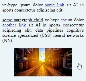
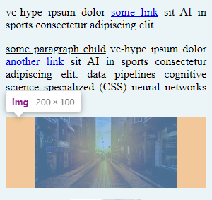
However, my initial implementation had one problem. When the image is too small to fill the full width of the parent container, clicking on the empty space to the left or right of the image would trigger the link and enlarge the image. This feels weird and is especially problematic on mobile devices because swiping and scrolling through the content could accidentally trigger a click.

Analyzing the problem source, we can see that the image tag (<img />) has a margin. The anchor tag (<a>) is wrapping around the image tag. So, it also wraps around the margin and the space it occupies. The margin becomes clickable, which we don't want.

In my use case, changing the markup was not an option because the HTML code was generated by Markdown to HTML conversion process similar to what is used in static site generators. But we can prevent the issue without adding additional HTML elements. The key is to remove the margin from the image tag (<img />) and instead apply it to the wrapping anchor <a> tag. Naively applying a horizontal margin to all anchors would be bad because it would butcher normal links in prose text. Therefore, the handy pseudo-class :has()1 can be used. The selector a:has(img) selects only the anchor tags that have an img as a child. This allows us to apply styles to the anchor that solve the problem.
Let's look at an example and then at my solution.
Some prose text inside of a container <article> element.
<article class="container">
    <p>
        vc-hype ipsum dolor <a target="_blank" href="https://google.com">some link</a> sit AI in sports consectetur adipiscing elit.
    </p>
    <p>
        <u>some paragraph child</u> vc-hype ipsum dolor <a target="_blank" href="https://google.com">another link</a> sit AI in sports consectetur adipiscing elit. data pipelines cognitive science specialized (CSS) neural networks (NN).
    </p>
    <p>
        <a target="_blank" href="https://picsum.photos/200/100">
            <img src="https://picsum.photos/200/100" alt="Here's some alt text." />
        </a>
    </p>
</article>
The CSS styles limit the width of the container.
body, p {
    margin: 0;
}

.container {
    width: 300px;
    background-color: #ebf4f7;
}

.container p {
    padding: 0.5rem;
    text-align: justify;
}

.container img {
    display: block;
    margin: 0 auto;
    background-color: #eee;
}
Here is the solution. We remove the .container img{ ... } ruleset and replace it with the following:
.container a:has(img) {
    display: block;
    margin: auto;
    max-width: fit-content;
}
The selector a:has(img) selects only the anchor tags that have an img as a child. These styles collectively ensure that the anchor tag behaves as a block-level element, wrapping tightly around the image, centered within its parent, and with no extra clickable space around the image. This results in a user-friendly layout where only the image itself is clickable, not the surrounding margin.
Here is a more detailed break down of the three CSS rules:
-
display: block;By default, an<a>tag is an inline element, which means it only takes up as much width as its content. When you set it to display: block;, the anchor tag behaves like a block-level element. This change causes the anchor to take up the full width of its parent container, but its actual width will ultimately be determined by the content inside it (in this case, the image) due to the max-width property set later. -
margin: auto;Applyingmargin: auto;to a block-level element centers it horizontally within its parent container. To calculating equal margins both sides of the element, the width must be defined, which we do with with the next rulemax-width. -
max-width: fit-content;Themax-width: fit-content;style sets the maximum width of the anchor tag to the size of the content it contains (here, the image). This prevents the anchor tag from extending beyond the width of the image.
Conclusion
The :has() pseudo-class is a powerful tool for creating specific CSS selectors. We used it to select only anchor tags that wrap an image as a child, so that no other anchors were affected. However, it's important to note that it is relatively new and only supported in all major browsers across the latest devices and browser versions since December 2023.
By implementing these CSS changes, you can enhance the user experience on your website, ensuring that images wrapped in links behave as expected, without any unintended clickable areas.
Footnotes
-
See conclusion for details on the browser support. ↩
Found a typo? Edit on GitHub